The project: Empowering women across the globe to effortlessly connect with experts from diverse fields, right at their fingertips.
As I pondered upon the project prompt, a serendipitous moment unfolded while grappling with a perplexing mechanical issue in my own car. In that very instance, I longed for a platform where I could seek guidance from a knowledgeable expert to unravel the mysteries beneath the hood. This longing, coupled with an unyielding drive for innovation, gave birth to the remarkable creation known as CarBabe.
CarBabe embodies the seamless convergence of technology and expertise, providing a sanctuary for individuals seeking swift solutions and sage advice in the realm of automobiles. It empowers users with the ability to transcend geographical barriers, enabling a global community of enthusiasts and experts to connect, share knowledge, and embark on transformative automotive journeys together. Join us on this exhilarating ride, as we revolutionize the way we seek and obtain guidance, one car-related query at a time. CarBabe awaits, ready to guide and inspire, igniting the passion within every auto aficionado!
Target market
Unlocking the road to empowerment, my vision soared high, targeting vibrant, forward-thinking professional women yearning to delve into the realm of automotive knowledge.
Embarking on the journey of crafting seamless user flows, I wove together simplicity and efficiency, empowering users to navigate through tasks with lightning speed. Each interaction became an exhilarating dance of intuitive design, ensuring that users effortlessly achieved their goals in record time.
Low Fidelity Prototypes
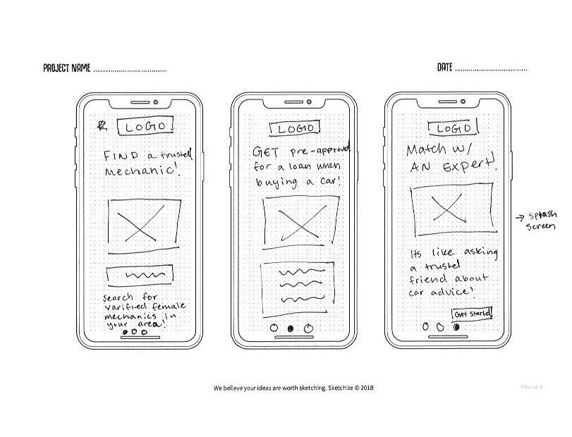
Immersed in the realm of automotive innovation, I embarked on a visionary quest to capture the hearts of my target market. With sketchbook in hand, I delved into a world of inspiration, drawing upon the brilliance of industry peers and the captivating experiences I had encountered within other beloved applications.
Driven by a deep understanding of the emotional rollercoaster that accompanies car troubles, I embraced the power of simplicity as my guiding star. My mission was clear: to distill the complexities of automotive woes into a harmonious symphony of seamless experiences. With each stroke of design, I wove a tapestry of clarity and ease, allowing users to navigate through the labyrinth of confusion with newfound confidence. The app became a beacon of solace, transforming the chaotic into the manageable, and empowering users to conquer their automotive challenges with grace and clarity.
Testing
Objects and Methodology
Do users understand how to navigate the key functions of the app and are they able to move through the tasks quickly without being confused?
How quickly do users understand what the app is and what it is about?
Users will be observed over zoom while using the screen sharing feature so I can see how they are interacting with the app. The test will include an introduction so the users can know what to expect.
Results
I used affinity mapping to organize my tests results and see where the biggest pain points were.
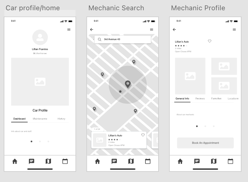
During the development process, a critical challenge emerged: the separation of the navigation bar and the menu. With the intention of reducing user overwhelm, I opted to minimize the information displayed in the navigation bar. However, this decision inadvertently introduced confusion rather than clarity. Lessons learned, I realized the paramount importance of cohesive navigation for intuitive user experiences.
Other issues surfaced, primarily cosmetic in nature, which will be meticulously addressed as I further refine the app's functionality. Every detail counts, as I strive to create a visually captivating and flawlessly functional user interface.
Fascinatingly, I discovered a common thread among my users—they had never encountered an app quite like mine. However, they expressed genuine enthusiasm for its potential, provided it catered to their unique needs. This revelation underscored the significance of customization and trust-building. In a world where user preferences vary, it is essential to deliver a highly personalized experience, instilling unwavering confidence and fostering a strong sense of trust among my valued users.
High Fidelity Designs
The next step was flushing out the final designs! I used A/B testing and peer feedback to adjust to the final prototype.
Lessons and Future Improvements
Throughout my UX design project, I gained invaluable insights that shaped my understanding of user needs and preferences. I learned the importance of cohesive navigation, realizing that the separation of the navigation bar and menu caused confusion rather than clarity. In hindsight, I would have prioritized integrating these elements for a seamless user experience. Additionally, I discovered the significance of customization and trust-building, recognizing the potential of catering the app to each user's unique needs to establish a deeper connection and enhance their overall satisfaction.


